Today’s graphics applications are incredibly sophisticated but may contain features that are incompatible with the latest developments in printing technology.
Likewise, some things can look great on screen, but not when printed.
Based on our experience, we’ve prepared a list of features we know can cause problems.
Contents
- Hairlines
- Texture and Postscript fills
- Layer effects and transparency effects
- Overprint
- Duotone/RGB images
- Borders
- Gradients
- Watermarks
- Aligning elements to folds
Hairlines
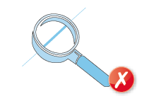 Hairlines are ‘device-dependent’ - this means that they print at different resolutions on different machines. They may print reasonably well on your 300dpi laser printer but will disappear on our 2400dpi plate-setter. Use 0.25pt stroke weight instead.
Texture and Postscript fills
These print erratically so it's best to save them as a TIF or JPG instead.
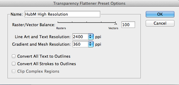
Layer effects and transparency effects
If you are using layer and transparency effects in your artwork, you'll need to supply your PDF as version 1.4 - this will ensure that any layer and transparency effects are honoured.
If you are saving as a version 1.3 PDF then your Transparency Flattener preset (in both InDesign® and Illustrator®) will need to be set on High Resolution setting ready for printing and applied again when creating/saving your PDF:
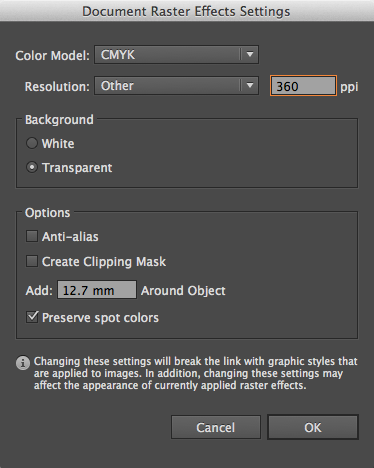
When working in Illustrator®, the Raster Effects Settings will also need to be set to vector:
Overprint
 Be careful with overprint settings (especially in QuarkXpress). If you set objects to overprint, they won't ‘knock out’ the background and will look very different to what you see on screen or proof.
Black text generally defaults to overprint as does the 100% black swatch in some applications (both of which are almost always fine). Please refer to your application manual for more details.
Duotone/RGB images
 These may print in black and white or with washed-out colours – you should always convert your artwork to CMYK first.
Borders
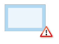 Movement during the guillotining process is inherent (NB -/+ 1mm for litho, -/+ 2mm for digital) and you should not expect the space between a border and the finished guillotined edge to be the same on every edge.
Even half a millimetre of movement can be noticeable, especially on smaller products like business cards, and can lead to an uneven/unprofessional look to the artwork.
Gradients
 Vignettes or gradient fills are best avoided – these are difficult to print and they have a tendency to show ‘banding’ and look unprofessional. The Help sections on the Adobe website which you may find useful:
Indesign (click here), Illustrator (click here) and Photoshop (click here).
Watermarks
 Be careful with using watermarks as they can make text or writing difficult to read if you've used too much ink. We cannot guarantee that ink below 5% will appear on the final output so we recommend using a tint between 5% and 7% for best results.
Aligning elements to folds
 Avoid trying to line up design elements with folds or creases. There’s a chance they may not land perfectly on the fold or crease and this can look unprofessional.

 Print this page